Tag: website design toronto

Breaking Out Of the Box: Design Inspiration

There is no doubt that simple Design is hard to find, since it requires a deep thought and inspiration. An intuitive simple design help visitors to accomplish their goals as early as possible. Colors and fonts play a major role to make the site stand out. Today, you will explore a couple of illustrations that may inspires you to try out some new color combinations and techniques.

Have a look at the following examples that uses inspiring shades and color palettes , 3D artwork with links and watercolors.

A Writer, A Hero

a-writer-a-hero-opt

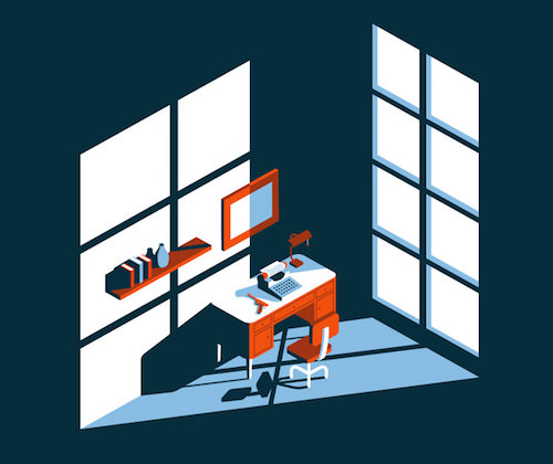
Clever executed light & shadows. The typewriter and the gun are super cool. Just enough details to be convincing.

Santa Monica

santa-monica-opt.jpg
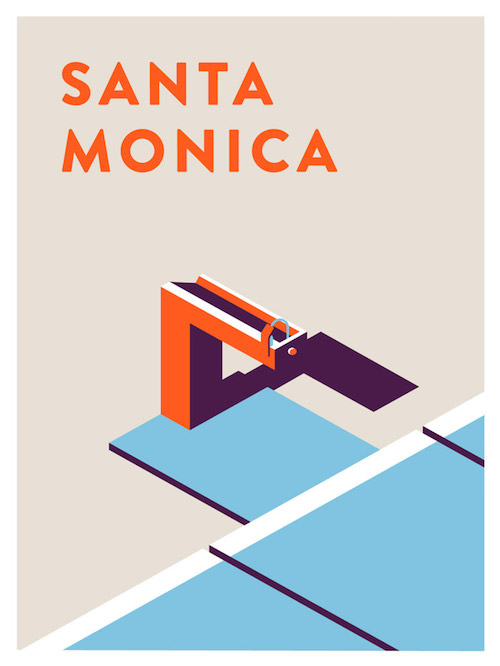
Illustration based on water fountains in Santa Monica. It’s the illustrative interpretation of Jeremy Booth. The shadows & light are like his trademark to recognize the work is his.

Girl – Goldfish

girl-goldfish-opt.jpg
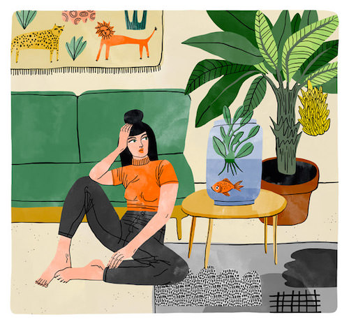
Refreshing style especially if you know it isn’t created on a computer. Bodil Jane is an illustrator from the Netherlands who creates almost all of her illustrations with ink and watercolors.

The Upshot

the-upshot-opt
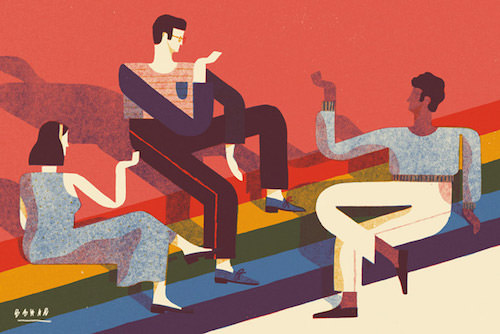
Illustration for The New York Times about an article that talks about how the same-sex marriage effort found a way around polarization. The legs and arms are such an eye-catcher here. I love the geometry and the way the colors are applied.

First Place Coffee

first-place-coffee-opt
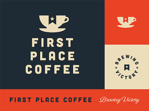
Identity for First Place Coffee. Smart how the star ribbon is cut out in the coffee cup.

Patagonia Dreaming II

patagonia-dreaming-II-opt
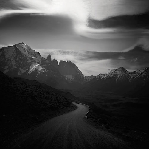
Black and white photography can be super powerful. The mountains are of course a very thankful subject to work with as well. The light is so perfect in this photo. It creates this mystical atmosphere.

Dave Matthews Band 25th Anniversary

dave-matthews-band-25th-opt
Insane amount of details in this poster to celebrate the fact that the Dave Matthews Band has been performing for 25 years. The texture on the car to get those details in are seriously inspiring.

36 Days. Numbers

A beautiful example of character webdesign. The distinctive feature here is the small head in combination to a much larger body. Great colors too. You can check out the other characters as well.
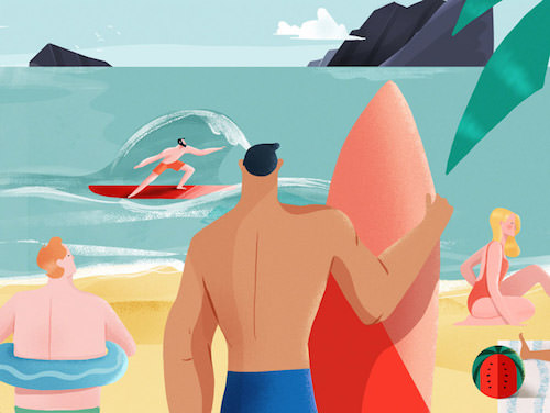
 

Playa/Beach Link

The design looks so wonderful with a tasteful color palette followed by analysing those lines with the darker parts on the body. It looks easy, but it isn’t. Look at the beautiful waves!

beach-playa-Xoana-opt

Canada Website Design : Imediadesigns, is the leading web design and development resource located in Canada. We will ensure the best user experiences with everything we build.

6 Guidelines for Designing High-Performance Mobile User Experiences

high-performance-mobile-user-experiences

No doubt, trust, and integrity are two main pillars of a strong relationship between the people. The same principle applies to brand’s product and their services. So it is necessary for each firm to create a first positive impression to improve its brand value. The design is the vital element when building lasting relationships with end users.

As usability of mobile devices has been increasing, users expect mobile services to perform well. Therefore a mobile user experience is a crucial factor to a trustworthy website.
In this article, we will discuss some guidelines that can help you design high-performance mobile user experience while meeting the needs of end users and businesses. Our team has collected these guidelines while designing native mobile applications in Toronto for multiple mobile platforms. Mobile applications need to improve its utility, need to be fast and reliable in order to stand in those environments.

Following these guidelines, designers are able to create a look and feel that is memorable and high-performing.

1. DEFINE UI BRAND SIGNATURES

Each user experience must reflect the purpose of the brand. Focus on the elements which are essential for improving brand recognition and loyalty.
Examples are featured images, wording, font style, and animations. Implementing these building blocks improves the design value and encourages customers to convert.

2. FOCUS THE PORTFOLIO OF PRODUCTS

Whether a company wants to launch a new website or want to promote its multiple products on one platform or if facing limited time and resources. At this point, design priority matrix needs to be setup to put the efforts on some of the targeted products that matter most. This kind of website design efforts helps to optimize performance in the most productive areas.

3. IDENTIFY THE CORE USER STORIES

Sometimes while designing the app, our teams have lost the initial list of requested features or impossible for them to build within the requested time period. While designing the product, it is important that customer should never be lost while finding and purchasing the product they are looking for regardless of whatever other functions that enrich the overall experience.

4. OPTIMIZE UI FLOWS AND ELEMENTS

Users can’t wait till your website elements load completely. Optimizing the UI elements and flows make visitors hold on your website and stop them from thinking that they are wasting their time. Various key points affect the Optimization of every UI elements –

  • The number and type of UI elements on the screen
  • Element characteristics
  • Drawing technique

5. DEFINE UI SCALING RULES

However creating the most appealing web design which navigates smoothly is difficult. It is required to maintain the balance between functionality, aesthetics, usability and performance of a website. An UI scaling toolkit could help by conveying the relative significance of UI components.

6. USE A PERFORMANCE DASHBOARD

Performance dashboards are introduced to judge the performance of various design constraints plus the expectation of designers, developers, and marketers which are affected by the different requirements at all stages. We use dashboard for the following elements:

• Core user stories
• Benchmark
• Current measurement
• Goal
• Status

Conclusion

We have discussed six guidelines based on the different aspects of mobile app design. At IMediadesigns, our team is capable of improving the performance of brand products considering all the key factors in the web design process.

Best Online Courses for Future Web Professionals

Best Online Courses for Future Web Professionals.png

For many of us, high school is already completed, higher education is also over before we know it. Now what to do next? Everyone is looking for a job related to their mainstream course. Everyone wants to have a high paid job career. In order to get that you need good skills to earn more than the average person. This article is for those who wants to pursue their career in the world of internet.

To become a web professional, you must acquire more knowledge of this industry. In most cases, people are taking different types of classes to get certified in one of the skills or you can say technologies that help you get qualified to undertake the job about which you have been dreaming. But sometimes life does not bring favorable conditions, in that case, online courses provide you with the anytime schedule, can be the best solution to such a situation.

There are several best online courses that will help you become a good web design and development professional.
Go Get a Design Job!

HTML5, CSS+, JavaScript Basics

html

Want to learn how to create a fully responsive design as IMediadesigns does? Join this course held by Richard Sneyd where you can learn the main points of CSS, creating dynamic content using JavaScript, incorporate the most powerful HTML tags, and more! Look at our responsive templates & responsive designs!
Pricing: $19 !!!

Photoshop for beginners

ps-design

To become a professional web designer, you first need to learn the basics of Photoshop. This will help you practicing without having to drown in text-driven theory. join this course with Barin Cristian Doru to become a Photoshop warrior!
Pricing: $149

Photoshop CC for the Web

photoshop-web

Dreaming about cool wireframes and ravishing mockups, well this course by Train Simple help you speed up your workflow and improve your web design skills.
Pricing: $79

Become a Senior User Experience (UX) Design Strategist

user-experience

Want to become a web design leader? Mariano Goren will teach you tricks and principle UX design strategies to improve your productivity.
Pricing: $299

Total Web development Course

web-development

Laurence Svekis

This course will help you become expert at various web development topics. Like HTML, CSS, jQuery, PHP, Bootstrap, MySQL, JavaScript, and WordPress on the fly. Pricing: $40

Python Programming: The Step-by-Step Python Coding Guide

Jason Cannon , here you will learn everything about Python scripts and Python in common. Even you can download all materials for free.
Pricing: $199

C++ From Beginner to Expert

Join Arkadiusz Wlodarczyk course and become a C++ pro!
Pricing: $77

The WordPress Wizard Bundle

wordpress

Ever dreamed of developing a WordPress website? This offering by StackSkills contains different cool themes and templates to develop a future site.
Pricing: $999

Build Your Brand: Blogging, SEO, Social Media & Relationships

Learn to optimize website ranking in the search engine results following web marketing hacks together with Rob Cubbon and become an SEO Expert!
Pricing: $99

Hope this article help you learn the web technologies and courses from scratch.

Custom Web Design: Imediadesigns, is a leading web design and development resource located in Canada. We will ensure the best user experiences with everything we build.

How Functional Animation Helps Improve User Experience

People are attracted to visual elements more frequently than content driven creatures. However, we can maximize this impact with the help of animation. The rotating objects and the animated images are like eye candy and bright elements that invoke a call to action and help your website stand ahead from its competitors.

As a result, more and more web designers are considering animation as a functional animation that improves user-experience. It is considered as an important tool to meet the user and business goals. Creating a good UX is no easy task, using animation in web design at the place as well as at the right time can help you achieve UX goals. Apply UI animations with a purpose; make sure they are meaningful and functional.

In this article, we’ll talk about the role of functional animation in UX design and see when to incorporate motion into a design. Before we start, know what Functional animation is? Including a subtle animation in UI design to improve the overall functionality of the website. It has very clear and logical purposes including:

• Reduce cognitive load
• Prevent change blindness
• Establish better recall in spatial relationships
VISUAL FEEDBACK ON USER ACTIONS

An interactive web design provides feedback which makes you feel like you’re interacting with real elements such as buttons and controls on the screen. Visual feedback informs users about results of an operation. For example, a shake animation can be used when a wrong password is entered.

funcanimation7

PURPOSE:
• Acknowledge that the system has received a user’s action.
• Confirm (or deny) a user’s action.
VISIBILITY OF SYSTEM STATUS

Visibility of system status is one of the important principles in user-interface design. Here you will able to understand the current status at any given time. For example – Data uploading and downloading processes are a great result of a functional animation.

Fun animation also distracts users from what's happening behind the scenes and helps makes them wait longer
PURPOSE:

Provide real-time notification of a current process, and enable the user to understand what is going on in the system easily.

VISUAL HINTS

A first time user may find it difficult to use a mobile app interface especially interfaces which contain unfamiliar or unique interactions. To help them use your UI, provide them a set of visual hints which drives their attention to the possible interactions.

Shutter animation in Apple iOS 6 camera app

For example, this functional animation can be found in the iOS camera app.

PURPOSES:

• Create necessary expectations by giving the user a clue of what is about to happen
• Help users orient themselves to the interface
• Tell users how they can interact with elements on the screen

NAVIGATIONAL TRANSITIONS

Navigational transitions are movements between different states in an app, from a high-level view to a detailed view. State changes often involve hard times for user, however using Functional animation you can help them through these moments of change.

The content and surface of each tab stays at the same level and the animation simply guides focus between views. Image credit: Behance /></a><sup class=

PURPOSES:

• Define the spatial relationship between screens and elements
• Avoid a surprising transition by helping users comprehend the change that has just happened in the page’s layout

BRANDING

Whereas the previous animations are quite logical, this one is full of emotions. There are hundreds of apps that offer same user experience but the one which people love must have established some emotional engagement with them.

brand-closeup-1
PURPOSES:

• Entertain users, bring fun to the design
• Create a signature of the product; help users relate to the product, increase a brand value.

Conclusion

Creating an animation which has utility only a half part .to be successful, one must build them naturally during a design process. When done correctly, animation can turn out to be a memorable experience for users.

Custom Website Design Toronto: Imediadesigns, is a leading web design and development resource located in Canada. We will ensure the best user experiences with everything we build.

Beginner’s Guide to Conducting a UX Design Review

beginners-guide-to-conducting-a-ux-design-review

The IT industry is devoted to the people who uses online products, services, and applications. Today every business considers building an online presence from a website which serves its purpose. A website has its strengths and weaknesses. Sometimes the user will become frustrated when not finding an information they need or not completing the task set up in their mind.

Most of the companies hire UX designers or a web design professionals to conduct a usability review. The usability review is taking the system and compare it to a list of “standard practices“. But if you have the knowledge, you can conduct UX review yourself.
In this post, we will let you understand the basics of a UX review and how you can run one yourself. We have to dig deeper and look at the functions and find solutions to improve website’s performance. There are no guaranteed successes, but most websites benefit from a UX review with a competent designer. Before we start let’s know:

What Is a UX Review?

A UX review is to study goals, objectives, and usability problems of a website and makes recommendations on how to fix them.

A scenario review.

A scenario includes the most common and important tasks that are crucial to the success of the system, think from user’s point of view. But everyone has different personas in order to evaluate the sites for their needs. So pick a site, pick a persona, pick a task and try to complete it.

A heuristic review.

While conducting UX reviews, go through the methodical sequence from a range of different sites and systems. Heuristic reviews enable us to measure against best standard practices across the board.

Best UX Review Tools.

User testing

Testing with real users is the best Review type for identifying issues or to fully understand the site or system in hand. We can then identify areas where the users run into problems. It allows us to get the direct feedback from the audience and discuss a number of different views and issues.

app-usability-testing

Hotjar

05-hotjar-homepage-dashboard
It always good if you can learn about how people see your website. A heat mapping tool, like Hotjar, is vital for tracking user behaviors. An affordable tool which can work for any size business.

Verify

06-verify-app-homepage
The Verify is specifically made for UX review tests. You select from a handful of different tests, like A/B tests, heatmap tests, user behavior tests, and personal feedback tests. So that we can best improve the websites for the user. You can also read this post —http://imediadesigns.weebly.com/blog/combining-ux-design-and-psychology-to-change-user-behavior

Hope you understand what a UX review is and how it works. Now pick a website and get started.

Imediadesigns, is a leading website design resource located in Canada. We will ensure the best user experiences with everything we build.

The Future of Web Design Trends 2017

The end of 2016 is around the corner. The digital industry is growing very fast and with the continuous advancement in web technologies, it is becoming more competitive than ever. To make your business stand out, make sure your website is designed with the current web design trends. Being a developer you need to keep on learning and improving new skills to meet the expectations of your clients.

In this article, we will give you some insights of future web design trends for the year 2017.

1. Mobile First Design

Many of you are familiar with the term mobile-first design. As the name suggests, we must focus on the mobile devices first then move to the bigger ones. Nowadays, a website must be responsive to all screen types as the pure desktop website has been punished by Google. Google has provided a new online tool that is more informative than the old one.

A Test with the New Tool:

speedtest-mobile-google-techbrain-768x372

2. Website Speed

Another most important thing which will surely buzz in 2017 is the website’s optimization for extremely fast loading times. Google has suggested a speed limit of 1.5 seconds for a website’s entire loading process to be completed.

download

3. Interactive Story Telling

Though Interactive storytelling is very complex, But It offers a smooth website design experience to the user. Each scroll tells a story about the products and services it offers and changes the screen content.

find-your-story

4. Micro Mini Interactions

The term microinteractions refers to the product interactions based on singular tasks such as pressing a button, setting an alarm, or clicking “Like”. Visiting Facebook or LinkedIn allows you to engage with dozens of microinteractions, most of which are invisible or too small to be noticeable.

smartphone-micro-mini-interaction-1024x730

5. Handcrafted Illustrations

Native images have been trending for a while now. They cover the entire screen space, creating a unique visitor experience.it is highly recommended you use a Handmade, original illustrations which has a much higher recognition value, and clearly show where the future will head to.

Some Examples:

lighthouse-brewing-company

6. Widespread utilization of rapid prototyping tools

Rapid prototyping tools suchas, UXpin, Webflow, InVision and Marvel allow programmers to quickly create fidelity prototypes of sites and services to guide them create something aesthetic, all without writing a single line of code. Some allow you to design in the browser and even launch the website itself right from the tool.

7. Video

background-video1-1024x592

Video backgrounds are getting more popular via premium themes available to purchase –if you belong to some industry it’s good to take a video yourself – as stock videos are quite expensive.

8. Centered and/or Split Content

Centered content is the most useful design trend these days. The main message is displayed in the center of the screen and creates a dramatic visual effect. Split content focuses on the content which has been divided into two areas, giving the designers more creative freedom.

melanie-daveid-1

Conclusion

No doubt, you are going to see a lot of exciting things in the coming year 2017. Hopefully, this article helps you create a web design strategy based on these significant trends. If you think I have forgotten something, feel free to leave a comment in the section below.

iMedia Designs | is a Toronto web design company, also involves in creating e-commerce web design and development solutions to all type of businesses in Toronto.

Adaptive web design: Pros and Cons

adaptive-web-design-pros-and-cons

Since the Google shows favoritism towards mobile-friendly websites and improves their search engine result for those sites that are optimized for viewing on a mobile device. Many companies now considering a responsive design as a part of their business development process. Today, the most challenging task for web designers is to optimize website designs for each type of devices.

From last few years, one phrase is buzzing around in the IT industry – responsive web design. Every other individual prefers this to reach out target audiences across a range of devices, but that doesn’t mean that alternative approaches like adaptive design shouldn’t be considered.

In this article, we will look at the pros and cons of an adaptive web design.

What is adaptive web design?

Adaptive web design (AWD) aims to provide a better user experience by creating a website that is applicable to a different platforms and screens , hence improve performance. Different layouts created depending on the screen size being used by the website user. This means that if a user comes to a website on a mobile phone, it will display the mobile version of the website that has been designed specifically for that platform.

Pros of AWD:

Super-efficient page loads

Adaptive website improves the load time performance and overall user experience. This is because it transfers only those assets which are necessary for the specific device and optimizing images and multimedia content with the relevant screen resolution and size.

Same Experience for Everyone

Mobile users will experience different behavior from desktop users. However, everyone viewing your site will get the same experience.

Less Maintenance 

A single responsive web design can reduce the time you spend updating your multiple designs.

Reach the maximum mobile Audiences

This is the most effective step to improve your brand awareness, also considered as the most inclusive globally robust approach.

Everything is on One URL

Whether a desktop, mobile or smartphone users, all can view a page using one URL which can help improve its search engine rankings.

Cons of AWD

Website Performance

Loading images are the biggest concern when it comes to supporting an adaptive website.

Resource and budget heavy

It requires a large team of developers and budget to develop an adaptive website.

Complexity

The approach is bit complex and expensive compared to responsive design. It’s quite challenging to serve the purpose of trying to use one set of content on one URL.

For more information on our web design services in Toronto, contact IMediadesigns at +1-647-799-0657

Top Essential Tools for Bloggers

sdfs

Nowadays running a blog is no small thing. It is done with the help of lots of tools to run a successful blog but knowing the best tools that to be used can be enormous. There are so many tools available online that you can use to run and manage you blog. When you are on a tight budget and cannot pay for it than it can add even more stress for deciding what tools to be used in your blogging business. These tools will actually help you as you start your blogging journey. They will help in taking you from blogging newbie to a confident and efficient blogger.

The tools used for blogging are great for saving and organizing all of your ideas and then finding them again whenever needed. Some of the most important tools are given below:

  • WordPress:

There are several blogging platforms and some of them may be easier for new users. But none of them is better than the WordPress. While WordPress may be slightly harder to get started with as it also provide web design and development, but it is well worth the time investment.

  • Gmail:

If you have several email addresses which are all automatically linked to Gmail email account. That way you can check all your emails from anywhere, any time – even if you are not at your computer.

  • Google Analytics:

You can use Google Analytics to see which of the blog posts are the most popular and check which websites send you the most readers. You can further use it as a reliable source for reader demographics and site statistics.

  • Evernote:

In Evernote, you can capture anything including the web pages, images, text, and voice notes as it is available as an app for your cell phone or iPad as well as web-based.

  • Dropbox:

Dropbox is considered as an important tool for the bloggers. As Dropbox offers free automatic storage for all of your files up to 2GB.

  • Google Docs:

Google docs is handy for sharing the documents online but best of it is that you can use it to create free online surveys with the results all can be shown in form of pretty pie charts.

  • Flickr:

Flick is also a must use tool for blogging as it provide photo sharing and you must be sure to add a photo credit at the end of your blog post.

  • Google Reader:

Once you have a Google email account you can use the Google Reader to follow all your favourite blogs from one spot.

Now don’t just read this blog and bookmark it, although you should do that too. Now you start downloading what tools you required so that you have all the tools at your finger-tips and can get blogging much faster and more efficiently than ever before you had done. Please also share in the comments if you have any further tips or tools to talk about!

Toronto Web Design |   iMediadesign is cost effective full-serviced digital agency, that offers ecommerce web design service in toronto.

9 Best Examples of Effective Mobile Website Design

Nowadays, it is essential for every business to make a website that looks good, work and perform better on your small screen devices. The success of any functional website depends on its degree of responsiveness that is the ability to adapt to the screen in which it is being viewed.

Research has shown that 91% of traffic comes from mobile devices, therefore it is an opportunity for every business owner to make a positive impression on its visitors. The responsive website is the best way to stand out and to execute the mobile design. Since Google is giving priority to mobile –friendly websites, developers, and designers are considering the mobile functionality to create the best user – experience when browsing on mobile.

A responsive Web Design helps you keep your customers or users coming back to your website for more business. To create a responsive website keep these principles in mind:
Consistency: Provide visitors with the same tools and features for browsing and filtering across all devices.

Use space intuitively: Focus the visitor’s attention on the most important elements Make your site clean and give a clear CTA (call to action – for example, “buy!”).
Put the viewer in control: Provide device specific user interactions and give the viewer the ability to choose what kind of user experience they want.

Here is a list of some beautiful websites which really nailed it on mobile web experience.

1) Shutterfly

shutterfly-mobile-site-1.png

2) Google Maps

google-maps-mobile-site-1.png

3) Typeform

typeform-mobile-site-1.png

4) Adrian Zumbrunnen

adrian-zumbrunnen.gif

5) Elf on the Shelf

elf-on-shelf-mobile-site.png

6) BuzzFeed

buzzfeed-mobile-site-2.png

7) Huffington Post

huffington-post-mobile-site-1.png

8) Nationwide Insurance

nationwide-mobile-site.png

9) Zappos

zappos-mobile-site-1.png

Hopefully, these responsive design inspirations help you create an engaging and user-friendly website with required functionality and information.

Website Design Toronto: iMediadesigns provide cost effective and innovative responsive web design solutions and offer custom web development services in Toronto

Beginner’s Guide to Creating a WordPress Website

wordpress guide
WordPress Website Development

Before you start thinking about a domain name, design, and color for your website, you must decide what platform you’re going to build your website? Back in 2004, websites were build using HTML and CSS, but it took a lot of time to become a master of those skills.Most people still think that creating a website from scratch is difficult or requires a lot of coding and designing skills.

WordPress made this easy for all of us and even for those who know little about programming languages. Today quarter of all websites is running on this platform. Also, it is considered as the most popular content management system (CMS) online being highly reliable, secure and easy to use.

Today’s article is for those who are new to WordPress. Here you will be learning about installing WordPress, working with domains, managing content and using some useful plugins and themes to secure your website.

All about Domain Names

A web address that identifies your site to others. Having your own domain is better than having your site on someone else’s domain. Let’s analyze a URL

http://www.blog.mywebsite.com

HTTP:// is the protocol that tells browsers how to retrieve data.

blog. is a subdomain which segments your site into different bits and pieces.
mywebsite.com is the domain name. .com is called a top-level domain

THE DIFFERENCE HOSTING AND DOMAIN REGISTRATION

Hosting is a place where all of your website data is stored. This is the most important part of any website, you must look for the host who supports WordPress. On the other registering a domain means you’ve gained legal ownership of a piece of Internet real estate. You can register your domain name with the same company you’re hosting your website with. Keep your domain name short and easy to write.For details see here – web development services.

Some reputed WordPress specific hosting providers are – WP Engine, Page.ly , ZippyKid, outstandingSETUP.

Installing WordPress

Depending on your account type, you might be able to add any number of WordPress installations to your account.

Creating a new website on Kinsta
Choosing a Theme and Plugins

There are plenty of WordPress themes and plugins are available – free or paid.You can install a plugin to perform a single task. While themes add the visuals for the front page.

Keeping WordPress Secure

• Always keep WordPress and all plugins and themes up to date.
• Always use strong passwords, and change your passwords every couple of months.

The above article will help you to create a perfect website using the noted CMS tool that is WordPress which is highly reliable, secure and easy to use for beginners.

Reference:
http://imediadesigns.weebly.com/blog/a-comprehensive-checklist-to-creating-the-perfect-wordpress-website
http://devca.imediamtl.com/website-design-toronto/tips-for-creating-a-good-website-that-visitors-will-appreciate/