Tag: creative web development

Surefire Tips to Develop a Successful Android App

According to recent research, more than a thousand apps are released each year on the android platforms related to games, business, and education, lifestyle, entertainment apps and so on.

Surefire Tips to Develop a Successful Android App

In order to stand out from the crowd on the Google play store, you have to come up with a unique android app idea. There is no doubt, the apps can play as one of the powerful platforms for promoting your business and sales. It will increase business reach and accessibility across various mobile devices. Therefore, organizations are hiring skilled android app developers who can create a custom app based on the user needs. However, not all apps get success, some fail to make an impact due to their poor UI design.

Here are few steps you must consider to ensure an app’s success:

1. Having a Concept and Idea

For any business, it is necessary to analyze your app idea first, determine how it is related to your business. Use your imagination to hold on to customers. Choose the platform you want to use to launch your app.

2. Understanding the Market

Do not rush into things as android is a bigger platform than any other mobile platforms. By understanding the market, you will be able to create an app with quality content and easy navigation. All features should be simple and easy to understand.

3. Pre-Design Efforts

Once you have the clear idea about your app, and the purpose behind it. It’s time to start preparing a blueprint of the app, including features, designs and technical specifications in hand. It is a very important step so that each and everything things which are entailed in pen and paper should be strictly followed –up.

4. Focus on Conveying the Needed Features

At this stage, you can remove the unwanted features to improve the user experience. Make clarity in conveying your app idea, draw what is relevant and important, add required features, and take references so that you will come up with a great plan for your app.

5. App Design and Development

It is the most crucial phase, you must hire a professional android app development firm, who can write lines of codes as per the design and predefined specifications using the current –end technologies.

Custom Website Design Agency : iMediadesign is reputed mobile app development IT industry in Toronto, specialize in eCommerce website design, Content Management Systems, WordPress, Magento web design and Search engine optimization.

Useful Coding Techniques for Web Developers

Superior programming skills and coding techniques indicate a professional programmer, although CSS is considered a simple and straightforward language, sometimes to develop a perfect website it requires skill and a bit of experimentation, web design community is complex, designers and developers all around the globe often face similar problems and share their insights with others.

We are always looking for such articles or posts so that we can provide the most useful content to our readers.

In this post, we will look at some useful CSS/jQuery coding tips, tricks and techniques for visual effects, layouts, and web form designs.

CSS Layouts: Techniques and Workarounds

Adaptable View: How Do They Do It?
This tutorial explains how to manually change a layout.

css-technique-01

Easy Display Switch with CSS and jQuery
A quick and simple way to enable users to switch page layouts using CSS and jQuery.

css-198

Quick Tip – Resizing Images Based on Browser Window Size
This quick tip shows how to switch between two image sizes based on the size of the browser, the DIV .

resize

One Page Résumé Site
free-html-resumes-june-2014-thulhu

Pegs: Automate Display: fixed++
Chris Wetherell posts on Pegs, a strategy for having one scroll bar but independent scrolling areas.

css-135

CSS 100% Height
This explains how to get a div to stretch 100% of the window’s height.

482

CSS3 Drop-Down Menu
A clean, simple a nice navigation menu, designed by Nick La.

css-technique-21

Fluid Images

Scroll/Follow Sidebar, Multiple Techniques
A really simple concept: the sidebar follows you as you scroll down the page.

css-technique-00

Vertical Centering With CSS
There are a few different ways to vertically center objects using CSS.

39

Create YouTube-like adaptable view using CSS and jQuery
youtube-adaptable

How To Create a Horizontally Scrolling Site
css-technique-02

Purely CSS – Faking Minimum Margins
min-margin is non-existent in the CSS world. After you’ve pondered and Googled it, check out the solution here.

css-technique-03

The article helps you to find solutions to the problems you are dealing with or will have to deal with in future.

Custom Web Development Toronto : iMediadesigns is a reputed It industry which offers custom web design services in Toronto.

Best Practices to Design a Solution Oriented Wireframes

wireframes-vs-mockups-desisdfsdsgn

Before we start the actual process of web design, we must visualize our ideas on a piece of paper to fully understand the structure of its content. One tool we have found particularly helpful is wireframes.

Wireframing helps to express our idea to others as well as to develop our concept apart from the initial level so that we can easily understand the relationships between the elements and flow of the web application such as navigation, imagery and calls to action.

The audience can make suggestions and change the things to the best output. If the visual appearance is not as appropriate as they want, there is a problem with the wireframe. Make sure it is solution oriented.

Less Colors: Use colors for a purpose.

Colors may distract people, so it is better to use minimal color variations.

Consistency is the key to everything.

Your wireframes are designed to give a smooth experience not distract. One of the best ways to do this is to be consistent with things like typography, spacing, and delivery.

Use actual content

Content is kind anyway! It’s a part of designing process. Write your own story and use contents that are very similar to the actual contents. It will only help you understand the client and their needs.

Never wire alone.

Ideas have the potential to achieve greatness. It’s always good to share your ideas with other experts in the same industry.

Practice non-attachment.

Don’t get too attached to your wires, always entertain your client with the frequent changes.

Communicate functionalities and interactions statically. 

Wireframing is the best tool than prototyping as it helps to communicate functionalities and interactions statically.

Set clear expectations. 

It doesn’t matter how good you work is, if the client can’t listen to you. The best way to meet their expectation is to communicate them clearly, early, and often.

Be selective and keep it simple.

When you try to mix elements of one idea into another, things will not for you. Give each idea their own platform.

Control the conversation.

Support your wireframes by controlling the conversation.

Hope this article help you to determine the right tools to solve the web design and development problems. Above steps can help you to design a solutions-oriented wireframe.

iMediadesigns is a reputed It industry which offers custom mobile application development ,web design and development services in Toronto.

How to Reduce the Bounce Rate of Your WordPress Website

How to Reduce the Bounce Rate of your WordPress Website

Before we dig into the details, let us first look at the definition of the term “bounce rate”.

A bounce is defined as the single page visit and bounce rate is a percentage of single-page sessions on your website .Whenever a user visits on your page, spends some time on it and then exit the page, they are a bounce. Even the best blogs have a bounce rate 80%. So the question is why we are trying to decrease it.

Low bounce rate means more page views. Which means more user engagement on your site. On the other hand, high bounce rate is referred to a poor user experience. You can make use of Google Analytics to determine the bounce rate of your site

Today, everybody is familiar with the benefits and features of the most popular content management system that is WordPress. And as the web advance, every business organization want to develop a blog or a website to promote their product and services to the targeted customers.

Make sure that you use your bounce rate measure as a barometer of how smoothly your WordPress blog is working.

Today the biggest challenge is to find the best solutions to decrease the bounce rate of your client’s website.

Enhance User Experience
If users have a difficult time navigating through your website, you will surely get a high bounce rate. Luckily there are many ways to improve the user experience of your website design

• Create Good Content
• Make your navigation intuitive
• Make your website mobile friendly

Improve your page loading speed – if you want the visitor to stick to your business, you need to make sure that your web pages load quickly.
You can compress your images and choose a lightweight theme in WordPress.

Update your outdated content
 Don’t use pop-ups… unless you’re using Bounce Exchange
 Write shorter paragraphs
 Make your site search more prominent
 Make your 404 page more useful
 Reduce your broken links
 Make all external links open in a new window
 Invest in a great design
 Make sure your website’s cross browser compatible
 Avoid Flashy Pop-Ups

WordPress website development Toronto offers advanced web development services to develop a fully-fledged website.

Keep in mind, you need effective strategies to reduce the bounce rate as it doesn’t reduce overnight.You can also read this blog Ten Things Every WordPress Plugin Developer Should Know

Basic Elements for your Ecommerce Website Design

ecommerce website design

There is no doubt that e-commerce has transformed the retail industry, also, the demand of e-commerce website is increasing due to the increase in internet sales. It is now becoming a better option to traditional retail shops. The shopping experience at a physical store cannot be replaced by an online shop. On the other, there are different ways or basic elements that can make your e-commerce website more engaging and appealing and improve your online experience as well.

WordPress is one of the popular CMS platforms which provide all the necessary tools required to create and develop an online store. While it is still used as a blogging platform by a number of websites.

The template or layout –

There are a number of free or premium themes available, choose an ideal one for your online store that represents your business.

Keep a consistent and easy to use Design –

Once you choose a theme, don’t mix things, it will irritate users, the content, design and navigation together should bring the right user experience.

Clear Logo – 

A clear and remarkable logo is considered as an element of trust of the company and organization.

Shopping Cart –

Whether you are selling any type of products or services, this feature should be included on your website for the users to access and buy stuff from your online store. Shopify provides a reliable, secure shopping cart solution for your e-commerce website.

Integration with popular payment systems –

Offer multiple payment options to your customers the most popular option is PayPal as lots of customers have pay pal accounts and they prefer to pay by this rather than enter credit or debit card details into some other website.

Social Media Links –

We all know the importance of social media in our lives, there are many popular social networking sites like Facebook, twitter, LinkedIn and so on. Even if you have a small, start-up business, you should utilize these social networking sites.

Integration with postal services for shipping –

This is important if you plan on selling physical products and shipping them out yourself. There are tools available that will help you integrate your checkout system with Canada Post or a courier of your choice for shipping and handling.

Easy access to the user administration panel –

The WordPress allow you to make any changes to your site yourself. You can easily learn how to access the user administration panel.

Customer database maintenance –

Keeping a customer’s database up to date is one of the most important things in e-commerce. There are certain tools available for creating an opt-in page and keeping track of customer logins/signups as well.

Conclusion LINK

Hope, the above article will help you creating your e-commerce website design a more powerful weapon to grow your business and improve your conversion sales.

Movie Website Designs: Examples and Current Practices

Sometimes it can be an interesting experience for web designers looking around at sites that differ from web design industry. And it is even more interesting for movie lovers who are not satisfied with just watching a movie .they always search for all the details related to their favorite film like the cast, inspiration behind a story, fresh news about it and etc.

Movies are a big part of the entertainment industry and from past few years, their websites have become a critical part of their overall success.

The main purpose behind movie website is to do well at the box office in order to make it financially successful. Also, makers run their trailers and other videos on the internet that help them to engage audiences and encourage them to buy tickets online.

A movie website is the best solution to help them find what they looking for and provide some entertainment at the same time.For details visit this site.

A movie website must include

• Plenty of videos, including trailers,
• Easy access to showtimes and online ticket purchasing,
• Cast bios and other general info.

In today’s article, we’ll look at the websites of major motion pictures to see what types of websites are being created.

Trends of Current Movie Websites

1. FLASH

Flash

2. LARGE BACKGROUND IMAGES

Background Image

3. VIDEO/TRAILERS

Gran Torino Trailer

4. SHOW TIMES AND TICKET INFO

Ticket Info

5. SPLASH PAGES

Paul Blart Splash Page

6. DISPLAY OF NOMINATIONS AND AWARDS

Benjamin Button Nominations
7. SHORT PAGE LENGTH

Unborn

8. SOCIAL NETWORKING /MEDIA INTERACTION

Social Networking - Revolutionary Road

9. DOWNLOADS

Downloads

10. WIDGETS

Widget

Showcase of Movie Websites

TAKEN 

Taken

PAUL BLART: MALL COP 

Paul Blart: Mall Cop

THE UNINVITED 

The Uninvited

HOTEL FOR DOGS 

Hotel for Dogs uses a splash page that allows visitors to find local showings and get tickets, but not much else.

Hotel for Dogs
.
GRAN TORINO 

The website of Gran Torino is fairly similar to that of Taken, with a large dark background image and the trailer playing in the center of the screen.

Gran Torino

SLUMDOG MILLIONAIRE 

Slumdog Millionaire
Slumdog Millionaire has a splash page that displays the movie’s many nominations, awards, and positive reviews.

UNDERWORLD: RISE OF THE LYCANS 

Underworld: Rise of the Lycans

If you are involved in creating movie websites, hope this article will help you to improve your movie website designs. Do you like movie websites? What are your thoughts on this? Please share with us in the comments section.

Free High Quality Ecommerce Templates

Today, many eCommerce website owners are looking for a variety of options for selling their products and services and powering websites and shopping carts due to increase in internet sales. Out of which, though the custom design is always a good choice but templates are a popular option for those who wants to save their money and time.

A template allows you to browse your products by categories and brands. Also, a customer can choose a necessary colour, size and quantity of items. Premium quality templates are easy to find but they can be expensive, on the other side free high-quality templates are difficult to find.Thus we have done a thorough research for you, and in this article, you will explore some of highest quality free eCommerce website templates specifically for WordPress, Prestashop, osCommerce, Magento, Zen Cart, CubeCart, and CRE Loaded.

1. WordPress Templates

Crafty WordPress Theme | Demo | Download

Screenshot

2. osCommerce Templates

Cosmetics Store | Download

Screenshot
Computer Store 

Screenshot
3. Magento Templates

Electronics Store 3 | Download from eCommerce-Themes

Screenshot

4. Zen Cart Templates 

Screenshot

5. Acadame | Download from ichoze.net

Screenshot

6. Clean Blue

A collection of free CubeCart 3 Skins. More free Cubecart skins.

7. CRE Loaded Templates

Electronics Store | Download

Screenshot

8. General E-Commerce Templates

The following templates were created for the purpose e-commerce but integrated them in your e-commerce solution of your choice. Templates with valid HTML code are marked.

Clothes Collection | Download

Screenshot

Online Movie Store | Download (valid HTML)

Screenshot

Books Online | Download (valid HTML)

Screenshot

Beauty Company | Download (valid HTML)

Screenshot

In today’s article, we have presented some high-quality eCommerce website design templates, you can use and alter them easily according to your necessity. Most of them are used by all smart WordPress developers and designers all across the globe.

A little journey through Small and Big E-commerce Websites

As eCommerce is growing enormously from past few years. Both small and big eCommerce business owners are trying their best to give best possible experience to users. For this most business owners are willing to hire a designer and a Web developer to help them create the perfect eCommerce site.

Online shopping has become a convenient way to buy anything without any fuss. But remember people don’t spend their money online easily or it can be time-consuming and unpleasant.You need to find a way to be useful or stand out your web design from the rest. Here we will explore some eCommerce websites website that creates pleasant online shopping experiences.

Interesting E-Commerce Websites

Bonobos

Bonobos’ shopping experience is smooth. The design is elegant and clean. Good typography and use of subtle colors help us focus on the products and features. When a new item is added to the cart, a sliding sidebar on the right, directing customers to either keep shopping or check out. And the most important thing is the favicon – a bananas icon!

bonobos-opt


Martina Sperl

Martina Sperl’s website features polished photography of her products, with a simple navigation panel fixed on the right side of the page. The bold hover effect shows the item number and price boldly in a large sans-serif typeface. You can also view detail and get a 3-D view of the furniture. You can click on the “heart” icon to express your love for a product. Powered by WordPress.

Martinasperl

MadeForFun

Well, this online shop could be made for fun, however, quite snappy indeed. You can quickly customize each product with features displayed using an accordion pattern. The shop has rainbow-alike horizontal lines which still fit quite well into the design.

madeforfunmadesimo-opt
Indigo

Indigo’s site is a great example for those who have a relatively large inventory .they can have a quite nice user experience. Though navigation in the sidebar looks interesting, present at the bottom of each product page. As you add an item to the cart, the item is visually added to the shopping cart in the bar. The best part is it provides a discount if you are willing to invest some time into creating an account on the page.

joyandwonder-opt

Walmart

Walmart’s main navigation has been hidden behind the “Shop All. The reviews of each item can be rated as being helpful or not quite helpful. As an item is added to the cart, a lightbox appears directing customers to proceed to the checkout. The checkout is well-designed across resolutions, informative architecture, good layout, and good responsive redesign.

walmart-opt

Moomin

Sometimes it’s perfectly enough to provide a consistent visual style that guides the customers through the checkout. Since there aren’t many products in the shop, each item is prominently highlighted.

moomin-opt

EvyiEvyi

Here shopping cart and navigation is on the left which is great. Because the eye follows the top left to right pattern, making it more natural for users to keep track of the items in their cart.

Banana Cafe

The website has crazy 3-D hover effects across the entire shopping experience. The blocks rotate in different directions. The audio and video in the background complement the overall functionality of the site.The hover effects display a number that you would use in the contact form at the bottom of the page,

Conclusion 

You can also explore some other interesting online stores like Sew, Big Cartel, Greats, Le Col De Claudine, Orlando, Indochino and so on. Being a part of web development company, you need to create a store your users feel as comfortable as possible. We know spending hard earned money is difficult.It is important to improve overall shopping experience, latest design/UX techniques, quick checkout process, product description, good typography etc. to convert leads into sales. How can you optimize your checkout process? Let us discuss in the comments!

Dear Web User- Please Upgrade Your Browser

browsers

We all are aware of the most common tasks we perform on the World Wide Web like emailing. Shopping, Social networking. Reading. Finding directions. Banking etc. We do these things every single week or some people perform on a daily basis.

As a web designer, I want my user to have the best experience on the web. We at iMediadesigns, researching the standards and practices that we know will make your experience on the Web outstanding.But may be the browser you are using limiting your potential.so we are here to help you improving your experience on the web.

Your Browser Is Too Old

We use a web browser to access the web pages on a system. Without a web browser, we cannot view or access any website. That is why we might installed some programs that help us to access those web pages.one of them is Internet explorer, a Web browser made by Microsoft.

Over the past 17 years, this has been the most popular Web browser, which is currently at version 9, and version 10 is supposed to be officially released sometime this year. But I am sure many of you are not using IE9—most Web users that use Microsoft’s browser are still using a less stable, insecure, slow version of IE.

So we suggest you upgrade to a different browser. To help you upgrade, we recommend some tips for you to consider.

But before we start to explore other browsers, here we will discuss reasons why older browsers like IE7 and IE8 aren’t as good.

What’s wrong with Old Browsers?

  • Old browsers (especially Internet Explorer versions 6, 7, and 8) are less stable, and much more vulnerable to viruses, spyware, malware, and other security issues.
  • OLD BROWSERS ARE SLOW AND MORE LIKELY TO CRASH

Second, they are very slow. As Web page has to perform a number of different tasks to improve the website functionality. Old browsers do not perform these tasks with the same speed as new browsers. This may disturb your user experience and can sometimes cause your browser to crash or freeze.

  • OLD BROWSERS CAN’T DISPLAY MANY NEW WEBSITES

Third, is their display capabilities are very limited. For example, in an older browser, in order to show a simple animation, the person creating the website  needs a lot of extra programming code (called JavaScript) ultimately the page will take much longer to load, thus harming your experience on that website. New browsers support new Web technologies (like HTML5 and CSS3).

  • Fourth, Websites will neither look nor function in the same way in old browsers like IE8.

New Browser Options

Now that you understand why it’s highly recommended to upgrade an old browser, you can easily switch to one of these browsers.

Google Chrome

In May 2012, it has become the most popular browser in the world (compared to IE, all versions combined). Chrome was first released in 2008.

Mozilla Firefox

Firefox has been the main competitor to Internet Explorer since the mid-2000’s.

Opera

Opera isn’t used as much, but it has been around since the mid-90s. Opera has always been at the forefront of browser innovation and supports many of the latest technologies and features that make websites faster and more feature-rich.

Apple’s Safari
This is the same browser that’s commonly used on iPhones and iPads. Safari’s features are very similar to Google’s Chrome and has been around since 2003.

Why Are New Browsers Better?

The browsers listed above have a number of advantages over older browsers, including:

  • Far fewer instances of crashing or freezing.
  • Much more secure from a virus, malware, and browser-hijacking attacks.
  • Much faster page-loading.
  • Larger page-viewing area.
  • Unlike IE9 and the upcoming IE10, they can be installed on Windows XP.
  • Automatically update to the latest version, or will notify you to download an update.
  • A variety of useful optional plugins and add-ons that add extra features to improve Web browsing.

    Conclusion

    There are many reasons to upgrade your old browser so start upgrading your browser try something new which is easy to install and improve web design functionality on the web.it will definitely make your experience safer, faster, and much more beautiful than on old browsers.

iMediadesigns is a reputed web design and development agency placed at Toronto that helps the brand create unique identity and successful marketing campaigns.


Is Your Responsive Design Working? Google Analytics Will Tell You

As people expected to be able to browse the web on their phones just as easily as they browse the web on a desktop computer. Web designers are aggressively involved in developing and designing their website accessible to all screen types, especially on mobile devices.

Long ago, designers use breakpoints in CSS for particular screen sizes like 320 pixels for iPhone and 768 pixels for iPad, and then the sites were tested and monitored on those devices. As responsive design has evolved, they start working with content-centric breakpoints.so creating a responsive web design has become a dominant method in the field of web development.

However, we are just assuming that our designs will perform well with different devices. We need to monitor our website design’s performance with real traffic. Though there are many tools available in the market to track and measure responsive design changes.But Google Analytics has some great multi-device features built in. In this article, we’ll demonstrate how WURFL.js and Google Analytics can work together to show performance metrics across form factors.

Why Form Factor?
Speeding up and optimizing the user experience for a particular device or family of devices is always easier. However, every device has a particular form factor. Luke Wroblewski, an author of Mobile First, outlines three categories to identify device experiences:

Usage or posture,
Input method,
Output or screen.

The examples in this article use WURFL.js, including the form factors provided by it, which are:
Desktop,
App,
Tablet,
Smartphone,
Feature phone,
Smart TV,
Robot,
Other non-mobile,
Other mobile.

Feeding Data to Google Analytics

Put WURFL.js on the pages that you want to track. Simply paste this line of code into your markup:
//wurfl.io/wurfl.js
This will create a global WURFL object that you can access through JavaScript:
console.log(WURFL.form_factor);
Now that the script tag is in place, add the highlighted lines of code to Google Analytics’ tracking code:
/* Google Analytics’ standard tracking code */
_gaq.push([‘_setAccount’, ‘UA-99999999-1’]);
_gaq.push([‘_setDomainName’, example.com’]);
_gaq.push([‘_trackPageview’]);

/* Tell Google Analytics to log WURFL.js’ data */
_gaq.push([‘_setCustomVar’, 1,’complete_device_name’,WURFL.complete_device_name,1]);
_gaq.push([‘_setCustomVar’, 2,’form_factor’,WURFL.form_factor,1]);
_gaq.push([‘_setCustomVar’, 3,’is_mobile’,WURFL.is_mobile,1]);

/* The rest of Analytics’ standard tracking code */
(function() {
var ga = document.createElement(‘script’); ga.type = ‘text/javascript’; ga.async = true;
ga.src = (‘https:’ == document.location.protocol ? ‘https://ssl’ : ‘http://www’) + ‘.google-analytics.com/ga.js’;
var s = document.getElementsByTagName(‘script’)[0]; s.parentNode.insertBefore(ga, s);
})();
Or, if you have updated to Google Analytics’ new “Universal Analytics“, you would add this:
/* Google Analytics’ new universal tracking code */
(function(i,s,o,g,r,a,m){i[‘GoogleAnalyticsObject’]=r;i[r]=i[r]||function(){(i[r].q=i[r].q||[]).push(arguments)},i[r].l=1*new Date();a=s.createElement(o),m=s.getElementsByTagName(o)[0];a.async=1;a.src=g;m.parentNode.insertBefore(a,m)})(window,document,’script’,’//www.google-analytics.com/analytics.js’,’ga’);
ga(‘create’, ‘UA-99999999-1, ‘auto’);

/* Define the custom dimensions */
ga(‘send’, ‘pageview’, {
‘dimension1’: WURFL.complete_device_name,
‘dimension2’: WURFL.form_factor,
‘dimension3’: WURFL.is_mobile
});

Further, if you are using GA Universal Analytics, you must remember to define the custom dimensions. You do that by clicking Admin → Custom Definitions → Custom Dimensions.

GAcustomdim-preview-opt

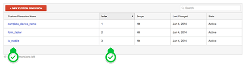
Analyzing the Data in Google Analytics Link

Now we need to avail data for inspection in Google Analytics. We can use custom variables in Analytics in a number of ways, just look in the menu on the left and click Audience → Custom → Custom Variables:

image01-preview-opt
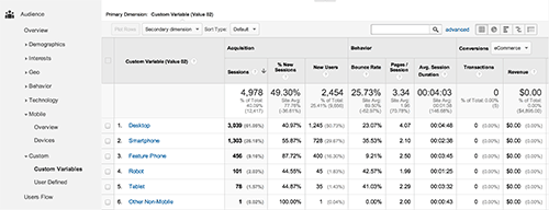
“Custom Variables” report. (Large version)
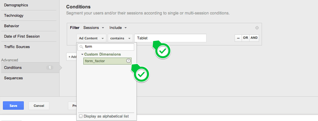
If you are using Universal Analytics, you’ll have the custom dimensions available as any other dimension in all reports in GA:

GAUIcustomdim-preview-opt
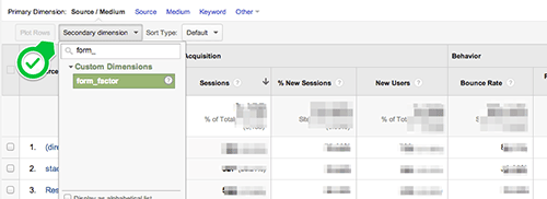
Accessing custom dimensions. (Large preview)

You will get a pretty good picture of how form factors behave differently. You can also find best metrics to focus on that will obviously depend on your website, but in general, pay attention to bounce rate and pages per visit.

GAcustomin2-large-opt(Large preview)

Google Analytics will show these segments in most of its standard reports as separate dimensions in charts and tables:

image02-large-opt

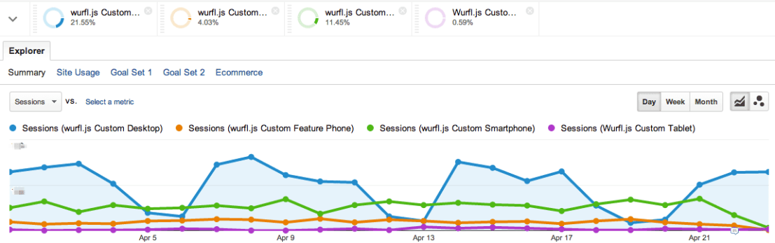
Segments chart. (Large version)

We have used Google Analytics here, but WURFL.js is, of course, compatible with other analytics tools, as long as custom variables like the ones above are allowed.

Conclusion

In this article, we discovered that how performance per form factor is a key metric for monitoring a website and how WURFL.js and 
Google Analytics help to visualize this data. Also, bounce rate andpage-impressions per visit are key metrics.
To give you more assistance, we provide responsive web design template that you can install in your Google Analytics dashboard. Just follow the instructions to assign an Analytics property, which will then appear under Dashboards → Private.